deviant art

Deviant Login Shop  Join deviantART for FREE Take the Tour
[x]
Download Image
JPG, 1064×744
more ▶

More from ~JaystarNOW

Featured in Groups:

Details

December 22, 2012
196 KB
1064×744
Link
Thumb

Statistics

Comments: 89
Favourites: 7 [who?]

Views: 507 (0 today)
Downloads: 10 (0 today)
[x]
:iconjaystarnow:
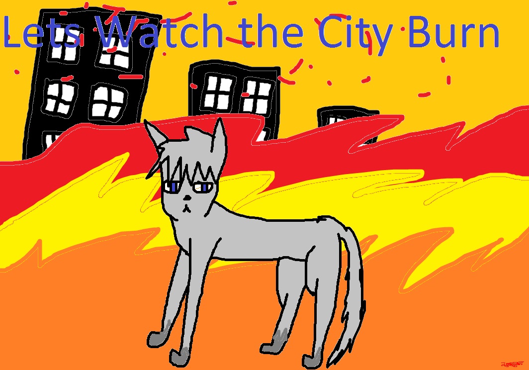
This is a pic I made on MS paint and no tablet so be kind this took me 2 hours cuz Paint is FIRETRUCKING stupid!
Add a Comment:
 
:iconkyyubirox:
Sorry, if this is harsh... but:

Vision; Look at some pictures of cats for anatomy. The head is round. Some cats heads are oval shaped a bit. And, fluffy so add some lines that look like > To make it fluffy :D The eyes... they are OK... just add those things at the bottom of your eyes that are a small <. The legs, those bumps then then straight lines don't look that great on it. The ears should be more of a ^ shape.
The hair should be bigger to kind of cover the eyes a bit. ;)
Also, with the paws add an L flipped vertically and placed~
The tail should be more left and make a curved line covering the tail where the big gap is.

Originality; Not very original. There are other people who have done an animal watching a city burn...

Technique; It's OK. Since it's unshaded and doesn't have a shadow it doesn't really look 3Dish. Since, you used the brush on the dark gray it has the stray pixels.

Impact; The gray cat stands out in the fire. Which is good~
The fire is made with the brush again so the fill bucket made it look all pixely again.

Overall; It could be a good picture with shading and using the pencil on different colors and fire.
What do you think?
The Artist thought this was FAIR
5 out of 5 deviants thought this was fair.

:iconswifteh-rawrs:
Alright- This is my first critique, so I'm sorry if I'm too harsh, or don't make sense or something.

Vision- First, the cat. I suggest studying some anatomy, as the legs, both back and front, look thin and unproportioned. The tail seems oddly connected and is in an awkward position. Next- the fire. Most fire is not composed of three solid layers of red, yellow, and orange. I would say that you should blend the three together better, perhaps by using intermediate colors between.

Originality- In general, a fire sence is not that original, but the reason I gave it 3 stars out of 5 was because the idea of a cat watching a city burn to the ground was intriguiging to me.

Technique- The unshaded and slightly scribbly lineart of this piece works, unfortunatly, agaist you. If you have straightined and smoothed the lines more, and added shading caused by the light of the roaring fire. Also, the awkward lines caused by the fill-bucketing tool take away from the overall piece as well.

Impact- Eh- the impact greatly suffers due to factors mentioned above, but the bright colors of the fire in contrast to the grey cat and dark buildings add to the ferociousness of the fire.

Overall- A nice idea, but it could have been implemented better. Study anatomy and shading a bit more, and this piece could be amazing!
What do you think?
The Artist thought this was FAIR
16 out of 16 deviants thought this was fair.

The Artist has requested Critique on this Artwork

Please sign up or login to post a critique.

:iconracotaco:
=racotaco Dec 30, 2012  Hobbyist Digital Artist
if you find it fun, then draw, it does not matter how it comes out as long as you enjoyed doing it. theres a lot of negative comments on this, and some are NOT called for. true, its not the best but unless you have a fair critique and actually want to HELP the person, then don't comment at all. just take a few tutorials, study the bone structures and how to draw fire and just try to improve the best you can :)
Reply
:iconjaystarnow:
~JaystarNOW Dec 30, 2012  Hobbyist Filmographer
thanks XD
Reply
:iconracotaco:
=racotaco Dec 30, 2012  Hobbyist Digital Artist
no problem ;3
prove them wrong :D
Reply
:iconjaystarnow:
~JaystarNOW Dec 30, 2012  Hobbyist Filmographer
Thanks XD
Reply
:iconracotaco:
=racotaco Dec 30, 2012  Hobbyist Digital Artist
x3
Reply
:iconjaystarnow:
~JaystarNOW Dec 30, 2012  Hobbyist Filmographer
lol
Reply
:iconphois:
*Phois Dec 29, 2012  Hobbyist Digital Artist

Honestly I like the face and though the background could have been spruced up a little more I like it. I noticed this is the NEW Ms Paint, and i recommend downloading the older version that I grew up with. Search around for the 2007 or 2008 version of Ms Paint, it's free, and a whole lot better than the junky new version. There are many tutorials on this site for cat anatomy, and red-lines. [link]
That's one of the many red lining groups and they help to try and correct your drawings so you can draw whatever it is better the next time ^_^
I'm sorry for the bad comments you've been getting.
Some people don't realize there are others who may have just started drawing, with a mouse
I remember back in 2008 i started drawing and posting my artwork that i did with a mouse and...well it wasn't the best ever. Taking time however, and trying to improve anatomy throughout almost five years up to today proved to be the best decision. You'll get better, that is if you even want to. Just draw for fun!
Reply
:icontriksilverwolf:
*TrikSilverwolf Dec 29, 2012  Hobbyist Digital Artist
Hmm, there are too many negative comments on this, seriously people, there's no need to be nasty, okay, maybe you personally don't think this is very good, but art is subjective so others may disagree, and regardless, you don't have to be rude, if you have nothing constructive to say then go look at something else.

Lol, this is probably better than I could do with a mouse X3 Although I agree with the other people who have posted sensible critique comments, there are obvious anatomical flaws etc but I won't restate them as others have already pointed them out, so I'll leave some positive observation - the expression on the face is good and I like the idea. Keep practicing and remember to use reference images when possible and you'll improve greatly in no time ^^
Reply
:iconxxmalokyxx:
i'll just save time for you ..
2 words pal , QUIT DRAWING .
Reply
:iconvincenttheawesome:
~Vincenttheawesome Apr 12, 2013  Hobbyist Digital Artist
IMA KILL YOU BITCH NO ONE HURTS MY CYBER-BEST FRIEND
Reply
Add a Comment: